HCUI - Honeywell’s Core User Interface Design System
The HCUI design system is distributed to over 50 product designers in the Safety and Productivity Solutions (SPS) business unit. These designers build for global products, with offices in Mexico, Australia, United Kingdom, India, and offices across the US. Designers, marketing managers and engineers are the main users of these Kits.
Goals of HCUI - Eliminate development churn to create a cohesive and consistent library of components, templates and experiences for product designers and engineers to leverage while they move fast to build commercial products for numerous industries.
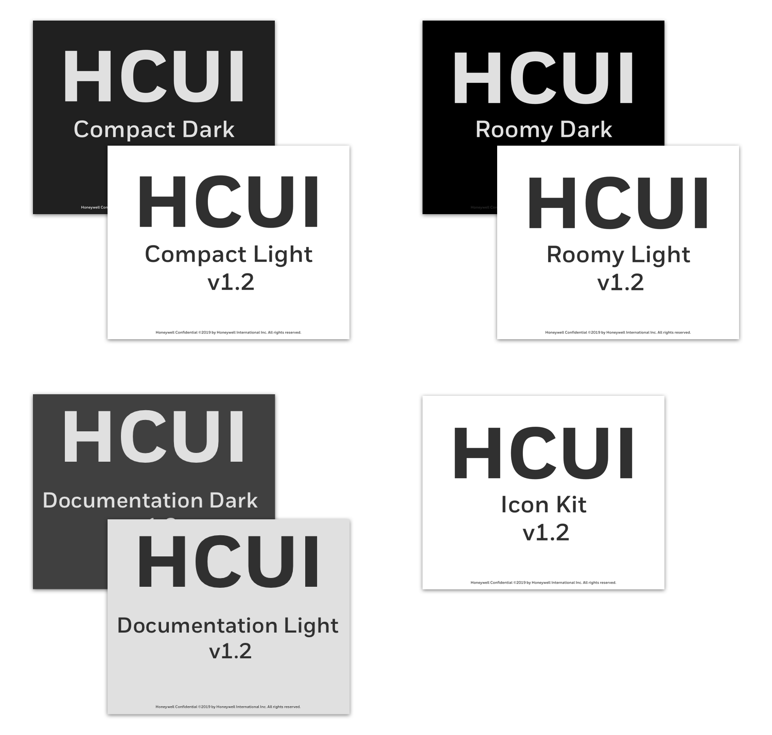
We created a total of 7 Kits (otherwise known as Sketch libraries).
Roomy - Dark and Light Themes
Compact - Dark and Light Themes
Documentation - Dark and Light Themes
Icon Kit
Collection of HCUI Kits
Preview of HCUI Roomy Light components
Preview of HCUI Roomy Dark components
HCUI Templates -
I created login screen templates for designers to easily drop into their workflows. I accounted for both a standard flow and single-sign-on flow requirements. All components are responsive to mobile and web+tablet sizes.
Screens for the standard login flow
Screens for the SSO login flow
Components built for the templates
Evangelizing the HCUI Kits
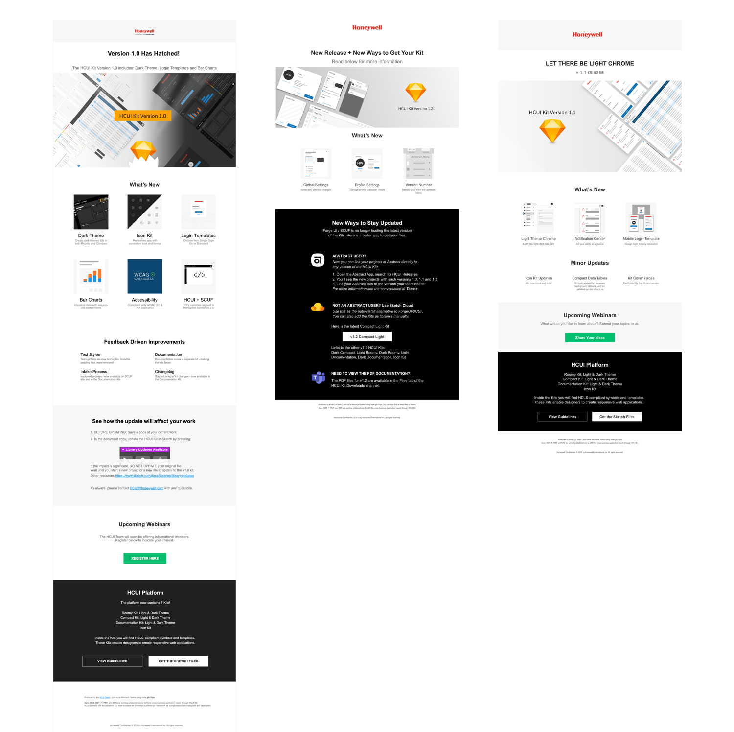
To communicate with the HCUI Kit users and leadership, I created and distributed e-newsletters.
The Team:
1 Researcher, 3 UX/UI Designers, 1 Design Manager
Design Work for Honeywell’s Global Initiatives
I created 2 design templates and a graphic available to employees across the company.
Create a Launch Icon
Create an In-app Icon
SUS Score Metric
Step-by-step template to create Launch Icon assets
Showcase Asset
SUS Score Graphic


